When building a pitch deck you need to ensure you are delivering your business, your values, brand and of course the detail.
You’ll find yourselves having multiple versions of your pitch deck, the three decks I keep in my data room are:
- One page summary
- Pitch Deck (10-12 slides)
- Detailed pitch deck (40-50 slides)
You will also (unfortunately) be told by each investor for an iteration, yet, this is very subjective and can lead you onto a path of investing time where it may not avail tremendous return, so include a structured document as an addendum, with FAQs testimonials, exit strategy and other requests.
If you deliver your story well, and can demonstrate you have the best team to deliver you business to the market, this definitive list will help you structure a pitch deck, which, along with your narrative will explain everything they’ll need to buy into you.
Please note, I don’t recommend sending your pitch deck when asked for it – that’s what the one pager is for. Both parties (if interested) should offer each other their time to learn more.
The title slide
The title slide is critical because it sets the tone for your entire presentation and provides the first impression of your business. The “title” slide is an obvious but impactful template to use for this one because it is clean, looks professional, and allows you to include essential information like your company’s name and contact information.

The problem/opportunity slide
Every business should solve a problem or improve customers’ lives in some way. Use this slide to clearly state the problem and how your business works to fix it. You can provide statistics with Beautiful.ai’s data slide or employ the numbered list or bulleted list slide to highlight all the issues that your business exists to fix. You could also use the image slide to tell the story of how your business came to be in a visually dynamic way.
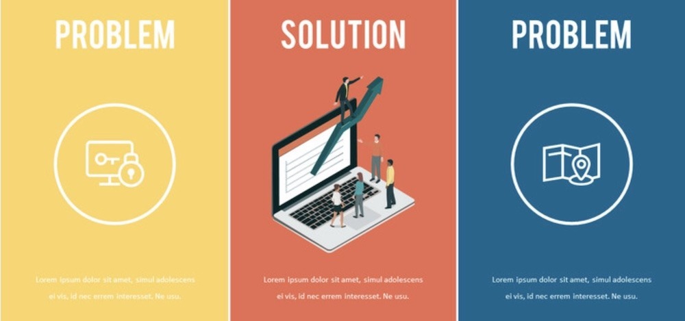
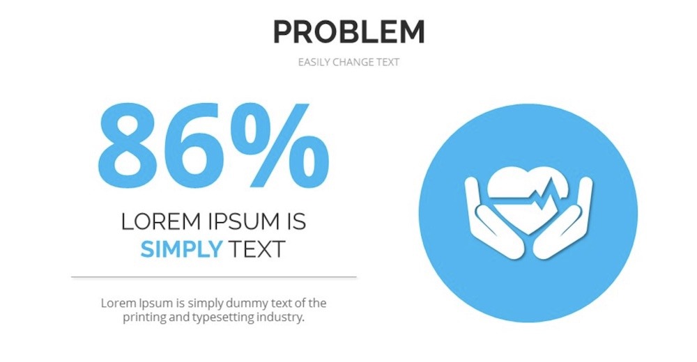
The value proposition
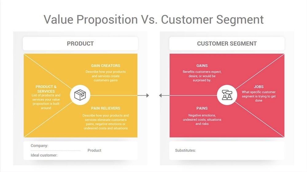
It is a no-brainer that you should discuss the value of your business, but common startup pitch decks overlook it! Don’t skip it. Ask yourself: What customer pain points do you fix? How do you serve your customers? What makes your business different? Use this slide to tell investors exactly why they should invest. The simplicity of our headline slide gives you the freedom to clearly state your value proposition, without crowding the slide with too much information. Want to make it visual? Add an impactful image or chart to the slide.
The underlying magic / Secret Sauce
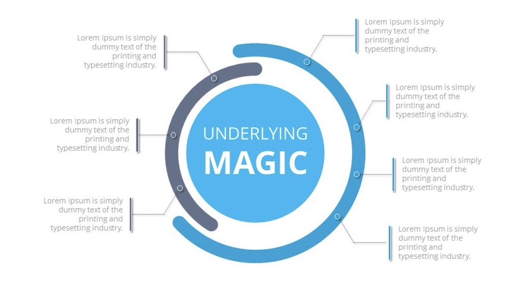
The investors know your unique value proposition by now, but what’s the real special sauce? What can only your team bring to life? To really score here, avoid over-relying on text. Instead, use this opportunity to show what you can do. An optional video slide taking the audience through your process works well here, as does a flowchart slide or a prototype, mockup, or demo.
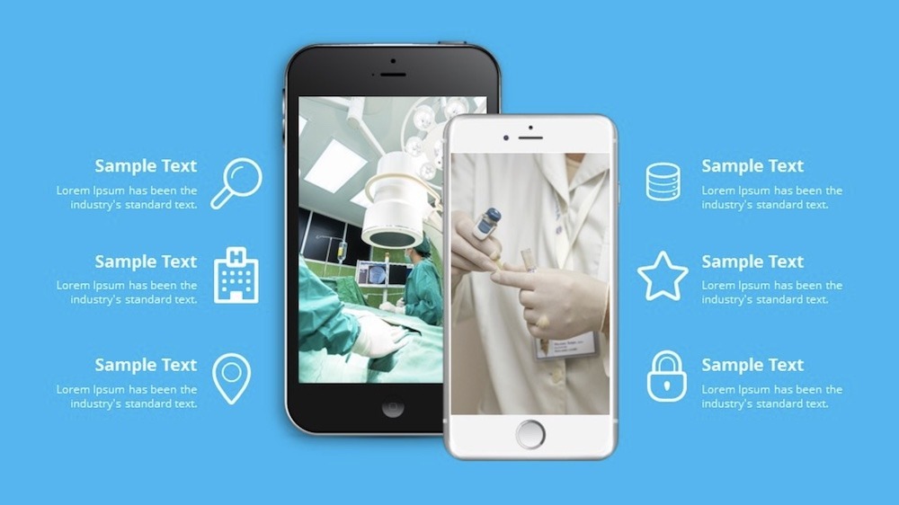
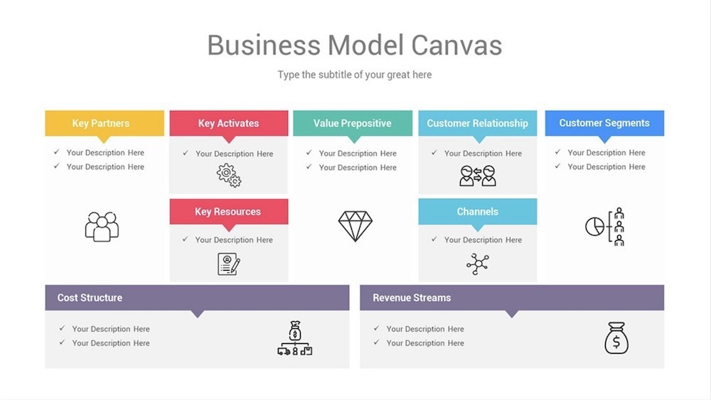
Business model
So, what is your plan? Any investor will want to know. Use a data slide, funnel slide, target slide, or hub and spoke slide to show your audience the different stages of your plan in a visually appealing way. You can also use a table slide or waterfall chart slide to demonstrate projected results and value over time.
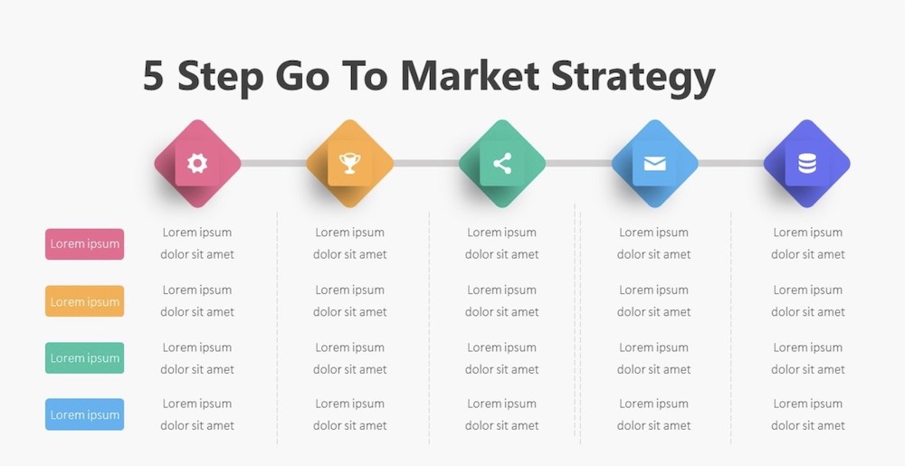
Go-to market plan
It is essential to tell investors how you plan to attract new customers, as well as compete in your space. How will you launch your product or offering and start selling it? This shows your investors you know how to make this thing work, so use the right slide to showcase it. You can use the hub and spoke slide or process diagram slide to demonstrate the different elements of your strategy.
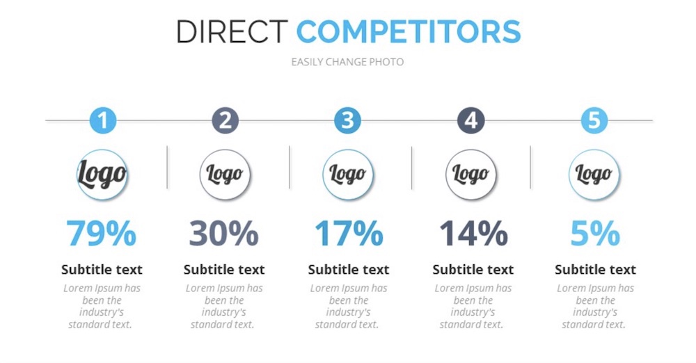
Competitive analysis
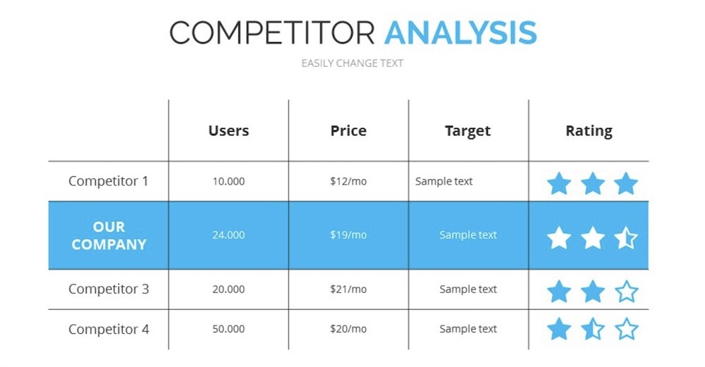
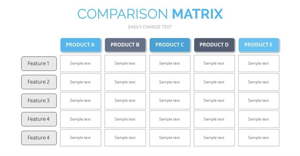
Let your audience know that you get what the competition is doing. Use an XY plot, line chart or area chart slide to identify your performance patterns compared to those of your competitors. This is also a great opportunity to demonstrate your achievements by highlighting companies that have had the pleasure of working with you using a logo grid slide. Don’t be afraid of comparing your self to others!
Management team
Potential investors want to know about the key players on your team. Use the team slide or about us slide to help them understand your biggest asset: your people.

Financial projections and key metrics
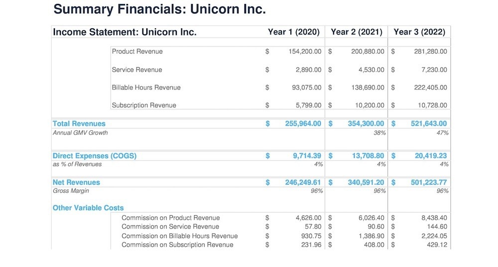
Be upfront: What would potential investors be getting into if they invested? Hone in on a three-year, bottom-up focused forecast. Use the data comparison slide or area chart slide to demonstrate and discuss your projected growth over the years.
Current status, accomplishments, timeline, and use of funds
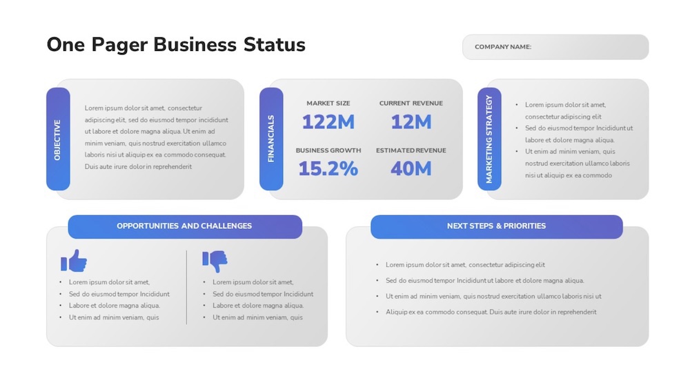
The future is important, but so is the present. Use this slide to address your current business situation, what the immediate future holds, and your plans for any capital raised right now. The timeline or process slides can help you effectively communicate exciting next steps for your business. This is also a slide where you need to really think about how to condense information into what’s most important.
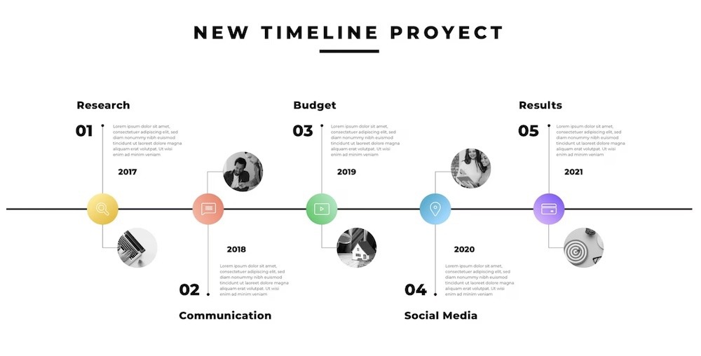
Your investors will be at the tail-end of their 20-minute presentation, and you want to make sure you go out with a bang.
These images are for reference of layout, I’d advise to use a branding expert to ensure consistency (it’s one of the best investments you’ll make), do you align with or below your peers?
I’ve built hundreds of pitch decks over the years, if you’re struggling and need an expert, reach out. What I can do in a few days may take others weeks.
Let me help. Get in touch